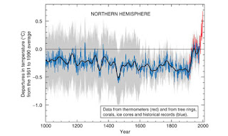
Michael Mann's record of temperature dubbed the "hockey stick graph" shows average global temperature over the past 1,000 years. Photograph: IPCC report
It is a persuasive image. The "hockey stick" graph shows the average global temperature over the past 1,000 years. For the first 900 years there is little variation, like the shaft of an ice-hockey stick. Then, in the 20th century, comes a sharp rise like the stick's blade.
The IPCC put the graph in the summary of its 2001 assessment reports. Although it was intended as an icon of global warming, the hockey stick has become something else – a symbol of the conflict between mainstream climate scientists and their critics. The contrarians have made it the focus of their attacks for a decade, hoping that by demolishing the hockey stick graph they can destroy the credibility of climate scientists. And in the man who first drew the hockey stick, a young paleoclimatologist called Professor Michael Mann of Penn State University, they have found an angry, outspoken and sometimes vulnerable foe.
Damagingly for the mainstreamers, the Guardian has discovered that there was a vitriolic debate within the mainstream science community in 1999, during preparation of the IPCC report, about the validity of the graph. Mann and CRU's tree-ring specialist Dr Keith Briffa are often portrayed by their enemies as co-conspirators, but the CRU emails reveal that back then they were actually in competing camps. Mann promoted his hockey stick. Briffa was very dubious, especially about the prominence the IPCC wanted to give it. Read more.

No comments:
Post a Comment